Overview
Understanding color theory is essential for photographers to enhance visual aesthetics and evoke emotional responses. The blog covers the color wheel, color harmonies, and the psychological impact of colors, providing practical tips for using color effectively in photography. Key techniques include setting the mood with color, experimenting with lighting, utilizing editing software, and creating contrast and focal points. Mastering these principles can significantly elevate your photography skills and improve the emotional resonance of your images.
Color is an integral part of photography, influencing both the visual aesthetics and emotional responses evoked by images. Understanding color theory can help photographers elevate their work and create striking visual narratives. In this blog post, we delve into the principles of color theory and how they influence photography, while also discussing practical applications to enhance your photography skills.
Understanding Color Theory
Color theory encompasses the understanding of how colors interact, the emotions they evoke, and the combinations that produce harmonious visuals. The traditional color wheel, created by Isaac Newton, outlines the primary, secondary, and tertiary colors, providing a foundation for color harmony in visual arts.
The Color Wheel
The color wheel is a tool for exploring color relationships. The primary colors are red, blue, and yellow. When mixed, they create secondary colors: green, orange, and purple. Tertiary colors emerge from the combination of primary and secondary colors, forming a complete wheel of color options to consider in your photography.
Color Harmonies
Color harmonies are relationships between colors that create visually appealing combinations. Some common harmonies include:
- Complementary Colors: Colors that are opposite each other on the color wheel, such as red and green. These combinations create high contrast and vibrant images.
- Analogous Colors: Colors that are next to each other on the wheel, like blue, green, and yellow. These create a serene and harmonious effect.
- Triadic Colors: A color scheme that uses three colors that are evenly spaced around the wheel, providing balance while still being dynamic.
- Tetradic Colors: Combinations of two complementary color pairs, allowing for a rich variety of tones and shades.
The Psychological Impact of Color
Colors have a strong psychological impact, influencing how people feel and react to images. Each color can evoke specific emotions or associations, enabling photographers to convey messages through their choice of colors. Here’s a brief overview:
- Red: Much like a passionate heartbeat, it conveys excitement, energy, and love.
- Blue: Often associated with calmness, it creates feelings of trust and stability.
- Yellow: Cheerful and uplifting, it evokes happiness and creativity.
- Green: Tied to nature and tranquility, it represents growth and harmony.
- Purple: Associated with royalty and luxury, it adds a touch of elegance and sophistication.
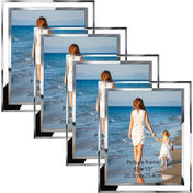
Color in Photography: Canon Photo Printer Reviews
When it comes to photography, capturing the right colors is essential, but equally important is the reproduction of those colors. This is where a quality photo printer comes into play. With the best Canon photo printer reviews, you can discover models that ensure your prints maintain the vividness and accuracy of your original images. Investing in a quality printer not only enhances the visual appeal but also communicates your artistic vision effectively.
Selecting the Right Printer
Choosing a printer that aligns with your color needs is critical. Look for features like pigment-based inks, which tend to last longer and provide wider color gamuts. Review highlights and feedback from buyers will help you to narrow down your choices. It’s worth noting that some Canon printers cater specifically to photographers aiming for enhanced color fidelity, making them ideal companions for your photography projects.
Practical Applications of Color Theory in Photography
Now that we understand the basics of color theory and its psychological impact, let’s explore how to implement these principles in your photography. Here are actionable tips to boost your color game:
Use Color to Set the Mood
Whether you're shooting landscapes, portraits, or still life, the color palette can dramatically affect the mood. For instance, using warm colors in portraits can render a cozy, inviting atmosphere, while cooler tones might evoke a sense of calmness and tranquility. Think about the message you want to portray before taking your shot.
Experiment with Lighting
Lighting is a significant factor in how colors appear in photographs. Natural light gives colors a different tone compared to artificial light sources. Experimenting with different times of day can lead you to uncover unique color combinations. Golden hour, for instance, can cast warm, soft tones that enhance most colors beautifully.
Utilize Editing Software
Post-processing is a powerful step in photography. Programs like Adobe Lightroom and Photoshop allow you to manipulate colors and tonal values. You can experiment with saturation, contrast, and color balance to bring your vision to life. However, it is crucial to maintain the natural look by not overdoing the edits, as colors can easily become unrealistic.
Creating Impact with Contrast
Using color contrast effectively can create striking results. As previously mentioned, complementary colors can energize an image and draw the viewer’s eye. Consider situational contrasts, such as vivid greens against a sky's deep blue or soft yellows against rich purples. The right contrast can enhance the depth and dimension in your photography.
Creating a Focal Point
Colors can guide the viewer’s eyes to a specific point in your image. By using a bright or contrasting color as a focal point, you can make your subject stand out, creating a clear hierarchy within the image. This technique proves particularly effective in portrait photography where the subject needs to capture immediate attention.
Color and Composition
Understanding color theory isn't just about the colors themselves; it ties into the overall composition of your photographic work. Compositions that align with color theory principles can create more engaging images.
Incorporating Color Gradients
Gradients use variations in color to establish continuity across a photograph. Rainbow gradients in landscapes create visually stunning effects, pulling the viewer into the image. Don’t shy away from gradients, as they can act as natural transitions in your work and elevate the aesthetic value of your photographs.
The Power of Monochromatic Schemes
Using monochromatic color schemes can create cohesive images with depth and interest while maintaining simplicity. Different shades and tints of a single color can evoke specific emotions and create an understated beauty that stands out in its own right. Black and white photography, for instance, can simplify a scene to its core elements while inviting viewers to engage with shape, form, and texture.
Final Snapshots: Elevate Your Photography Skills
Color theory in photography is not just a theoretical concept; it’s a practical toolkit that can enhance the quality of your work and the emotional response it elicits. By understanding how colors interact, the psychological impact they have, and the techniques to apply these principles, you can elevate your photography to extraordinary heights. Whether you’re reviewing a Canon photo printer for precise color output or experimenting with color in your compositions, mastery over color theory will pave the way for stunning visuals. Dive into the colors, engage with your artistic passion, and watch your photography flourish.
Linked Product

Canon PIXMA PRO-200 Wireless Professional Color Photo Printer
The Canon PIXMA PRO-200 Wireless Professional Color Photo Printer is designed for photographers and graphic artists seeking high-quality prints. With its 8-color dye-based ink system, this printer delivers vibrant colors and fine detail, making it an excellent tool for showcasing the nuances of color theory in photography. Its compact design and fast printing speeds ensure that users can produce professional-grade prints efficiently.
View Product