Color plays a vital role in photography, influencing not only the aesthetic of an image but also the emotions and thoughts it evokes in viewers. Understanding the psychology of color can help photographers to create stunning visuals that communicate their intended messages more effectively. In this article, we will explore how certain colors affect emotions, the significance of color theory, and how to implement these insights into your photography with tools such as the DSLR Macro Lighting Solution. Whether you're a novice or an experienced photographer, the treatment of color in your images can make a world of difference.
The Basics of Color Psychology
The influence of color on human psychology is significant. Different colors can evoke various emotions, associations, and responses. Here's a quick overview of some common colors and their psychological implications:
Red
Red is often associated with passion, energy, and excitement. It’s a color that commands attention and can evoke strong emotional responses. In photography, red can be used effectively to highlight important elements or convey a sense of urgency.
Blue
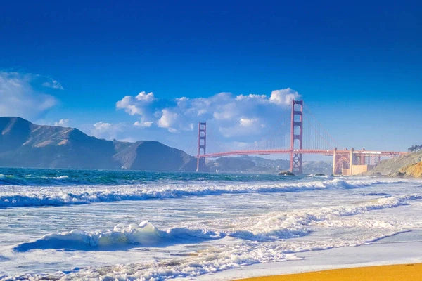
Blue typically conveys feelings of calmness, trust, and serenity. It can help create a soothing atmosphere in photographs, making it an excellent choice for landscape and portrait photography where tranquility is desired.
Green
Green represents nature, growth, and renewal. This color is particularly effective in outdoor photography, as it can reinforce themes of life and vitality. The use of natural greenery can also compliment specific subjects beautifully.
Yellow
Yellow symbolizes happiness, optimism, and warmth. It draws the eye and can bring a sense of joy. Be cautious, however, as overusing yellow can lead to feelings of anxiety or frustration.
Purple
Purple is often connected with luxury, creativity, and spirituality. It can evoke a sense of mystery and can be particularly captivating when used in imaginative photography.
Color Theory Essentials
Color theory provides a framework for understanding how colors work together and how they can influence the viewer’s perception. Here are some essential concepts to keep in mind:
Complementary Colors
Complementary colors are opposite each other on the color wheel and create a vibrant contrast when used together. For example, red and green are complementary. This high contrast can draw attention and create visual interest in your photography.
Analogous Colors
Analogous colors sit next to each other on the color wheel. They harmonize well and create a serene feel in images. An example would be blue, blue-green, and green. Using analogous colors can help create a cohesive look in your photographs.
Triadic Colors
Triadic color schemes consist of three colors that are evenly spaced around the color wheel. This can lead to a dynamic and vibrant image. In photography, selecting one dominant color and two supporting colors can balance the composition flawlessly.
The Impact of Lighting on Color Perception
Lighting significantly affects how we perceive color. The angle of light, the intensity, and even the type of light can alter the appearance of colors in photographs. Consider the following:
Natural Light vs. Artificial Light
Natural light, such as sunlight, tends to produce a more accurate representation of colors as opposed to artificial lights, which may cast unwanted hues. Understanding how your DSLR Macro Lighting Solution can mimic or manipulate natural light is crucial for achieving your desired results.
The Golden Hour
The golden hour, which occurs shortly after sunrise or before sunset, is renowned for creating golden hues and soft shadows. This is an ideal time for photographers aiming to create warm and inviting images.
Artificial Lighting Techniques
Using artificial lighting can open a treasure chest of possibilities. Color gels can be used to change the hue of your lights, allowing you to use color for mood enhancement creatively. With a DSLR Macro Lighting Solution, you can achieve precise control over how light illuminates your subject and interacts with colors.
Applying Color Psychology in Photography
Now that we’ve covered the basics of color psychology and color theory, it’s time to discuss how you can apply this knowledge in your photography practice.
Creating a Mood
Every photograph tells a story. The colors you choose can greatly influence that narrative. For instance, a photograph using blue tones can evoke calmness, while reds might generate excitement. Identify the mood you wish to create before taking the shot.
Setting the Scene
When planning your photoshoot, consider the colors in your environment. If you want to capture vibrant scenes, choose locations with bold colors. Alternatively, for minimalist images, you might select spaces with softer, monochromatic tones.
Post-Processing Adjustments
Editing your images can further enhance the impact of colors. Utilize tools to adjust the hue, saturation, and luminance of different colors in your compositions. This might mean boosting the greens in a nature scene or amplifying the warmth of a sunset.
Color in Product Photography
For those engaged in product photography, understanding the psychology of color becomes even more relevant. The colors in your images can directly influence customer perception and buying behavior.
Brand Colors
If you're promoting a brand, use colors that align with brand identity. For example, brands seeking to convey comfort and trust might use blue tones, while energetic brands may opt for reds or oranges.
Appeal to Emotions
Consider what emotions you want your products to evoke. In food photography, warm tones tend to make food look appetizing. Similarly, a skincare product shot with soft, calming colors may appeal to consumers looking for self-care.
Utilizing the DSLR Macro Lighting Solution
When it comes to close-up images, details matter more than ever. Using a DSLR Macro Lighting Solution can enhance the color fidelity of your product shots, bringing out the richness in textures and hues. Learn to manipulate angles and intensity for the best results.
Challenges Along the Way
While understanding color psychology is beneficial, there are challenges photographers may face. Here are a few to be aware of:
Personal Bias
Colors have personal meanings—what invokes joy in one person may not have the same effect on another. Always keep your target audience in mind when making color choices.
Technical Limitations
Different camera settings and lenses can produce varied results. Ensure that you’re familiar with your equipment and adjust your settings according to your creative vision. Make the most of your DSLR Macro Lighting Solution to overcome any lighting challenges.
Color Calibration
Sometimes colors may appear different on-screen than they do in print. Make it a habit to calibrate your devices to ensure consistency across mediums.
Final Thoughts on Harnessing Color's Power in Photography
The influence of color in photography extends beyond simple aesthetics; it’s about conveying feelings, creating narratives, and evoking emotions. By understanding the psychology of color, along with effective lighting techniques using a DSLR Macro Lighting Solution, you can enhance not only the quality of your images but also their impact on your audience. Remember, the world of photography is as vast as color itself—every hue has a story, and it’s up to you to ensure that story resonates. Embrace the power of color in your photography to engage audiences deeply.
Explore another user's Shopify or Wix store by following this link to their store. Keep in mind that this is a promotional link, and we assume no responsibility for the content of the linked store.